
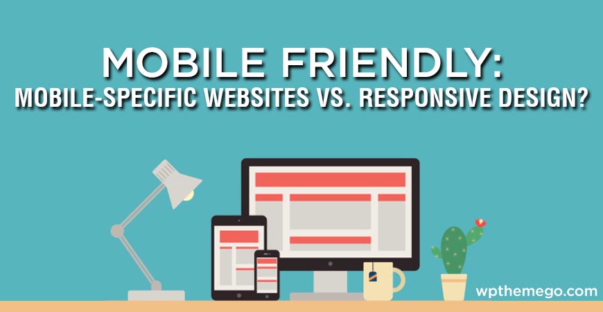
Mobile Friendly: Responsive Web Design or Mobile Web Design?
What is the difference between a mobile-specific site (or dedicated mobile site) vs. responsive mobile site? All of them may work for you depending on your needs. In this article, let’s take a look at their advantages and disadvantages.
WHAT IS A MOBILE-SPECIFIC SITE?
Mobile websites are generally a copy of your main website which have fewer pages, and those pages are built specifically to format on the mobile phone.
In many respects this is absolutely ideal. These kinds of sites are created and coded for the sole purpose of showing off specific content to mobile users. But there are still some pros and cons to consider when discussing dedicated mobile sites:
| The Pros | The Cons |
|---|---|
| User experience – Congratulations! You have a website that is specifically optimized for mobile devices, considering all benefits and limitations of the platform, so you have a good ground to create a beautiful and usable UX. | Multiple URLs – Your customer has to remember at least two URLs, or otherwise be redirected to the mobile website, which takes several seconds. The mobile website will need additional SEO work as well. |
| Speed – Your website will load fast and easily on mobile platforms. | Maintenance – You will have to maintain two websites. |
| Cost – Building a mobile website is not a cheap option as compared to responsive web design, but still you can get a very reasonable price for the value. For example, you could get 25% off on our Best-selling WordPress Themes with Mobile-Specific Design right now! | Not Universally Compatible. You have to consider that there are two different types of mobile devices: touchscreen and keyboard navigation. A single mobile website won’t look and work the same way across all device types. |
| Benefit from local search – Search engines tend to provide good UX nearly as much as you do, so in local search results mobile optimized websites have better chances to rank. | |
| Immediately accessible – Though not an extra advantage over responsive websites, but it still plays its role compared to native apps, where users have to pass through download and installation processes. |
WHAT IS A RESPONSIVE MOBILE SITE?
Responsive (sometimes called adaptive) means that you have one website which is specially designed and coded so that the content reformat’s to suit the device (tablet, mobile phone or desktop).
There are some of the pros and cons when using a responsive design forr your website
| The Pros | The Cons |
|---|---|
| A single website – It’s easier to administer just one website for all devices. | Redesign – Since the responsive movement/standard is still fairly new many websites that are 2+ years old probably aren’t responsive and may need a redesign or retooling to work. |
| Google Site Index – Google only has one website to index instead of a desktop and a mobile site | New/Flexible – This is partially for designers and partially for the businesses considering responsive, because of the “flexible” nature of responsive design it means design conventions are new. |
| A Single URL – This makes sure your users will find you on mobile devices without having to wait for redirects, which is helpful on slower connections. | User Experience. Mobile is a completely different experience than desktop, so having a single website, may harm your overall UX (User Experience) if not designed well. |
| Lower Your Mobile Bounce Rate – Responsive Design can ensures your web design is suitable for all devices and therefore stands the best chance at keeping your visitors for longer. | |
| Easy SEO – You can enjoy the benefits of your desktop website SEO on mobile devices. | |
| Low Cost – Simple math — one website is cheaper than two. | |
| User Experience – A seamless user experience, if the site is built well. |
WHAT SHOULD YOU CHOOSE: MOBILE-SPECIFIC WEBSITES OR RESPONSIVE DESIGN WEBSITES?
If you find that you want to create a completely unique experience on mobile, a mobile website may be the way to go. And if you currently have a mobile website and are not in a position to undergo a redesign, there is no need to worry. You could go responsive when you are ready for a redesign. Reponsive design is a good option for mobile-friendly websites at this time with various advantages.
In our opinion, there’s no perfect website – it all depends on what your end users want and need, and how you can best provide it.
If you still fret, the choice could be very simple at WPThemeGo. Since the Bootstrap 3 (mobile first) framework came out, every WordPress themes are responsive. We also have developing mobile-specific design successfully in our themes. It means that when you need assistance with going responsive or mobile-specific websites, please contact our Support Team. Our developers and designers would be happy to help!


Leave Your Comment