WELCOME TO SW POST ELEMENTS PLUGIN
Firstly, a huge thanks for purchasing this plugin. In this document, we will covers the installation and use and answers to common problems and issues for SW Post Elements. We encourage you to read throughout this document in case there is any difficulties. You can find more tutorials via the Frequently Asked Questions, WPThemeGo Forum and also contact us via our Ticket Support System.
SW Post Elements Features:
SW Post Elements is a powerful Elementor addon for Blog, Newspaper, Magazine website. With 09+ powerful elements, SW Post Elements will help to showcase the blog posts, images, and post categories beautifully with different styles for any blog, news, newspaper, or magazine WordPress website.
You can follow us on Facebook and Twitter for freebies, discounts and theme updates.
GETTING STARTED
To install this theme you must have a working version of WordPress already installed. If you need help installing WordPress, follow the instructions in WordPress Support.
Below are all the useful links for WordPress information.
- WordPress Codex – General info about WordPress and how to install on your server.
- First Steps With WordPress – General info about multiple topics about WordPress.
- FAQ New To WordPress – The most popular FAQ’s regarding WordPress.
Before installing the theme, please make sure that your hosting provider and website meet the minimum requirements as below:
To run SW Post Elements, we recommend your host and website support:
- Your web host has the minimum requirements to run WordPress.
- Your site with latest version of WordPress is prefered.
- Your site ready with Elementor 3.3+.
- Always create secure passwords for FTP and Database.
Important Note about PHP Configuration:
In several cases, you may deal with problems related to low PHP configuration limits, such as: white screen, demo content fails when importing, empty page content and other similar issues. The solution is to increase the PHP limits. You can do this on your own by editing the file php.ini file in the root directory or contact your web host and ask them to increase those limits to a minimum as follows:
max_execution_time 360memory_limit 256Mpost_max_size 64Mupload_max_filesize 64M
INSTALLATION
There are 03 ways to install SW Post Elements plugin into your site: Quickstart Installation and Manual Installation.
- Manual Installation via WordPress Upload
- Manual Installation via FTP/cPanel Upload
Preparation is always an imporatant part. Before starting, do not forget to:
- Make sure that your site meets Plugin Requirements and support the plugin.
- Have file
sw-post-elements-plugin_vx.x.x.zipready to go in your computer.
>>> All are ready? Okay, it’s time for us to go!
This is manual installation via Upload file path in the WordPress Admin Panel. Please follow steps as below:
- Login to your website and go to the Plugins.
- Click the Add New button.
- Under Install Plugins, click the Upload Plugin.
- Select the plugin zip file
sw-post-elements-plugin_vx.x.x.zipfrom your computer then click the Install Now button. - You should see a message stating that the plugin was installed successfully.
- Click the Activate button to activate plugin.
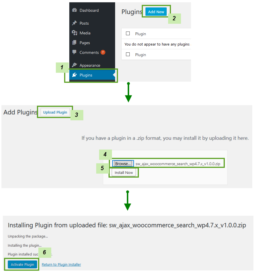
Congratulation! The plugin is successfully installed in your site. Now you can continue to play with it!
This is the manual installation. The plugin file will be uploaded into the server of the site domain. After that, the plugin will be activated in the Admin Panel. Please follow steps as below:
- You should have access to the server where WordPress is installed.
- Upload the plugin zip file
sw-post-elements-plugin_vx.x.x.zipup to your server path/wp-content/plugins/and unzip it here. - Login to your website and go to the Plugins section of your Admin Panel.
- Look for SW Post Elements and click Activate to activate the plugin.
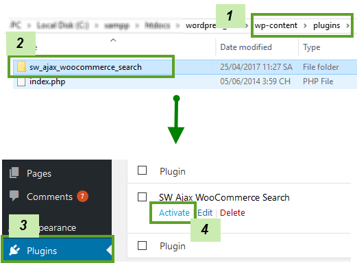
Congratulation! The plugin is successfully installed in your site. Now you can continue to play with it!
Ussually, when a required plugin is updated, we also update the plugin package. Therefore, when updating SW Post Elements, you can also choose to update plugin automatically.
To update plugin in SW Post Elements, please follow steps as below:
- Back up your site! to save your customization.
- Copy the custom code you made in your site and save it in your computer to add it later.
- Download the latest version of SW Post Elements.
- Deactive and remove old version of this plugin. You can directly delete this plugin’s files in folder /public_html/wp-content/plugins of your site using FTP.
- Now you can install new version in your site. If the max_size_upload > 8M, you can upload it via Admin Panel. Or else, you need to extract the plugin then add it to folder /public_html/wp-content/plugins of your site using FTP.
- Go to Plugins and Activate it.
- After all, check your site again to ensure that the update works.
Warning Before updating plugin in your site, you need to have a test first to make sure that it is compatible with the theme in your site.
SW POST ELEMENTS WIDGETS
SW Post Elements comes with various elements that let you to customize page in your site easily with Elementor. In this part, we will show you how to use the elements of this plugin.
Knowledge Base
Firstly, please make sure that you have background knowledge of Elementor. You can find the link here that have additional information about using Elementor: Elementor Documentation
How to add elements of SW Post Elements into your page?
To add this element to your page, please follow steps as below:
- Open your page and choose Edit with Elementor.
- Click on Add element icon of Elementor, then choose the element of SW Post Elements.
- Hover on this element and click on Pencil icon to edit it.
- After that, configure element options then Save change for this element.
- Preview the page and Update to save the change for this page.
How to edit elements of SW Post Elements?
To edit this element to your page, please follow steps as below:
- To edit the element, choose Edit with Elementor of the page.
- Hover on the element and click on Pencil icon to edit it.
- After that, configure element options then Save change for this element.
- Preview the page and Update to save the change for this page.
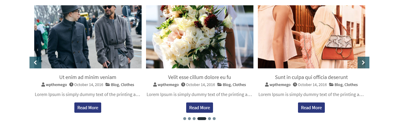
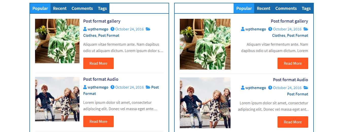
SWE Post Slider is a widget of SW Post Elements plugin – a powerful Elementor addon blogs, newspapers, magazine websites. It will help to show the posts as a slider beautifully in different styles.
SWE Post Slider Settings
Backend Settings: See screenshot
CONTENT:
Content Settings:
- Layout Style: Choose Default, Image Left or Content Overlay style for the slider.
- Post Format Media: Choose Show or Hide to activate/ deactivate option to use post format media.
- Show Image: Choose Show or Hide to activate/ deactivate option to use image.
- Image Size: Choose and use the image size for the slider.
- Show Post Author: Choose Show or Hide the post author in the slider.
- Show Post Categories: Choose Show or Hide the post category in the slider.
- Show Post Excerpt: Choose Show or Hide to enable/disable the post excerpt in the slider.
- Excerpt Line: Enter the value for the excerpt lines.
- Show Read More: Choose Show or Hide to enable/disable the read more in the slider.
- Read More Text: Enter the read more text of the post to show in the slider.
- Show Info Icon: Choose Show or Hide to enable/disable the info icon of the post in the slider.
Querry:
- Categories: Choose the categories to show post in the slider
- Post Number: Enter the number of the posts to show in the slider.
- Exclude post IDs: Enter the IDs of the posts to exclude from the slider.
- Order By: Set the post filters to order the posts in the slider.
- Order: Choose DESC or ASC to the post as descending or ascending in the slider.
Slider Config:
- Slides To Show: Set the number of columns to show in the slider.
- Slides To Rows: Set the number of rows to show in the slider.
- Slides To Scroll: Set the number of product to scroll in each slide.
- Space Items: Set the space between items in the slider.
- Arrows: Choose Show or Hide the arrow of the slider.
- Dots: Choose Show or Hide the dots of the slider.
- Autoplay: Choose Show or Hide to use or not use the autoplay mode for the slider.
- Autoplay Speed: Choose the speed of autoplay for the slider.
- Loop: Choose Show or Hide to use or not use the loop for the slider.
- Lazy Load: Choose to use the lazy load as Progressive or On Demand for the slider.
STYLE:
- Post Items: Include options for background, padding, border type, boder radius and space.
- Post Image: Include options for fix image, height, border, background, opacity.
- Post Content: Include options for position, typography, color, background, border type, border radius, padding, and margin of the post title, info, description and read more text.
- Arrows & dots: Include options for space, block, size, color, background, border radius.
ADVANCED:
- Advanced: Include options for margin, padding, z-index, CSS ID, CSS classes.
- Motion Effects: Include options for scrolling effects, mouse effects, sticky, entrance animation.
- Background: Include options for background type.
- Border: Include options for border type, border radius and border shadow.
- Mask: Include options for mask.
- Positioning: Include options for width and position.
- Responsive: Include options to hide on desktop, table or mobile.
- Attributes: Include options to add custom attributes .
- Custom CSS: Include options to add your own custom CSS.
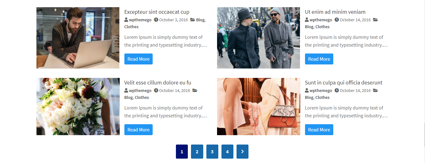
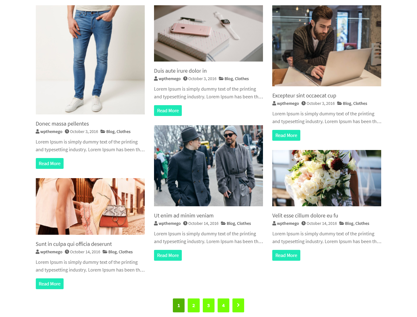
SWE Post Grid is a widget of SW Post Elements plugin – a powerful Elementor addon for blogs, newspapers, magazine websites. It will help to show the posts as a grid beautifully in different styles.
SWE Post Grid Settings
Backend Settings: See screenshot
CONTENT:
Content Settings:
- Layout Style: Choose Default, Image Left or Content Overlay style for the grid.
- Post Format Media: Choose Show or Hide to activate/ deactivate option to use post format media.
- Show Image: Choose Show or Hide to activate/ deactivate option to use image.
- Image Size: Choose and use the image size for the grid.
- Show Post Author: Choose Show or Hide the post author in the grid.
- Show Post Categories: Choose Show or Hide the post category in the grid.
- Show Post Excerpt: Choose Show or Hide to enable/disable the post excerpt in the grid.
- Excerpt Line: Enter the value for the excerpt lines.
- Show Read More: Choose Show or Hide to enable/disable the read more in the grid.
- Read More Text: Enter the read more text of the post to show in the grid.
- Show Info Icon: Choose Show or Hide to enable/disable the info icon of the post in the grid.
Querry:
- Categories: Choose the categories to show post in the grid
- Post Number: Enter the number of the posts to show in the grid.
- Exclude post IDs: Enter the IDs of the posts to exclude from the grid.
- Order By: Set the post filters to order the posts in the grid.
- Order: Choose DESC or ASC to the post as descending or ascending in the grid.
Grid Config:
- Colums fo Rows: Set the number of columns to show in a row.
- Pagination: Choose to show style of pagination including None, Numeric or Button Load More.
- Space Items: Set the space between items in the grid.
- Space Bottoms: Set the space from the items to the bottom of the grid.
STYLE:
- Post Items: Include options for background, padding, border type, boder radius and space.
- Post Image: Include options for fix image, height, border, background, opacity.
- Post Content: Include options for position, typography, color, background, border type, border radius, padding, and margin of the post title, info, description and read more text.
- Arrows & dots: Include options for space, block, size, color, background, border radius.
ADVANCED:
- Advanced: Include options for margin, padding, z-index, CSS ID, CSS classes.
- Motion Effects: Include options for scrolling effects, mouse effects, sticky, entrance animation.
- Background: Include options for background type.
- Border: Include options for border type, border radius and border shadow.
- Mask: Include options for mask.
- Positioning: Include options for width and position.
- Responsive: Include options to hide on desktop, table or mobile.
- Attributes: Include options to add custom attributes .
- Custom CSS: Include options to add your own custom CSS.
SWE Post Masonry is a widget of SW Post Elements plugin – a powerful Elementor addon for blogs, newspapers, magazine websites. It will help to show the post beautifully as a mansory in different styles.
SWE Post Masonry Settings
Backend Settings: See screenshot
CONTENT:
Content Settings:
- Layout Style: Choose Default, Image Left or Content Overlay style for the grid.
- Post Format Media: Choose Show or Hide to activate/ deactivate option to use post format media.
- Show Image: Choose Show or Hide to activate/ deactivate option to use image.
- Image Size: Choose and use the image size for the grid.
- Show Post Author: Choose Show or Hide the post author in the grid.
- Show Post Categories: Choose Show or Hide the post category in the grid.
- Show Post Excerpt: Choose Show or Hide to enable/disable the post excerpt in the grid.
- Excerpt Line: Enter the value for the excerpt lines.
- Show Read More: Choose Show or Hide to enable/disable the read more in the grid.
- Read More Text: Enter the read more text of the post to show in the grid.
- Show Info Icon: Choose Show or Hide to enable/disable the info icon of the post in the grid.
Querry:
- Categories: Choose the categories to show post in the grid
- Post Number: Enter the number of the posts to show in the grid.
- Exclude post IDs: Enter the IDs of the posts to exclude from the grid.
- Order By: Set the post filters to order the posts in the grid.
- Order: Choose DESC or ASC to the post as descending or ascending in the grid.
Grid Config:
- Colums fo Rows: Set the number of columns to show in a row.
- Pagination: Choose to show style of pagination including None, Numeric or Button Load More.
- Space Items: Set the space between items in the grid.
- Space Bottoms: Set the space from the items to the bottom of the grid.
STYLE:
- Post Items: Include options for background, padding, border type, boder radius and space.
- Post Image: Include options for fix image, height, border, background, opacity.
- Post Content: Include options for position, typography, color, background, border type, border radius, padding, and margin of the post title, info, description and read more text.
- Arrows & dots: Include options for space, block, size, color, background, border radius.
ADVANCED:
- Advanced: Include options for margin, padding, z-index, CSS ID, CSS classes.
- Motion Effects: Include options for scrolling effects, mouse effects, sticky, entrance animation.
- Background: Include options for background type.
- Border: Include options for border type, border radius and border shadow.
- Mask: Include options for mask.
- Positioning: Include options for width and position.
- Responsive: Include options to hide on desktop, table or mobile.
- Attributes: Include options to add custom attributes .
- Custom CSS: Include options to add your own custom CSS.
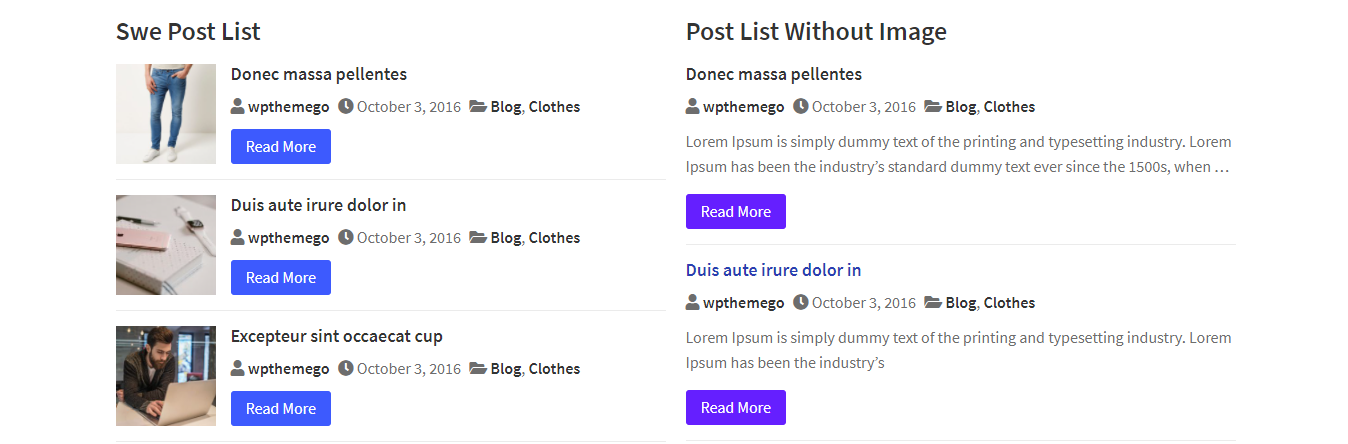
SWE Post List is a widget of SW Post Elements plugin – a powerful Elementor addon for blogs, newspapers, magazine websites. It will help to show the posts as a list beautifully in different styles.
SWE Post List Settings
Backend Settings: See screenshot
CONTENT:
Content Settings:
- Show Image: Choose Show or Hide to activate/ deactivate option to use image.
- Show Post Author: Choose Show or Hide the post author in the list.
- Show Post Date: Choose Show or Hide the post date in the list.
- Show Post Categories: Choose Show or Hide the post category in the list.
- Show Excerpt: Choose Show or Hide to enable/disable the post excerpt in the list.
- Show Read More: Choose Show or Hide to enable/disable the read more in the list.
- Read More Text: Enter the read more text of the post to show in the list.
- Show Info Icon: Choose Show or Hide to enable/disable the info icon of the post in the list.
Querry:
- Categories: Choose the categories to show post in the list
- Post Number: Enter the number of the posts to show in the list.
- Exclude post IDs: Enter the IDs of the posts to exclude from the list.
- Order By: Set the post filters to order the posts in the list.
- Order: Choose DESC or ASC to the post as descending or ascending in the list.
Config:
- Pagination: Choose to show style of pagination including None, Numeric or Button Load More.
STYLE:
- Post Items: Include options for background, padding, border type, boder radius and space.
- Post Image: Include options for fix image, height, border, background, opacity.
- Post Content: Include options for position, typography, color, background, border type, border radius, padding, and margin of the post title, info, description and read more text.
ADVANCED:
- Advanced: Include options for margin, padding, z-index, CSS ID, CSS classes.
- Motion Effects: Include options for scrolling effects, mouse effects, sticky, entrance animation.
- Background: Include options for background type.
- Border: Include options for border type, border radius and border shadow.
- Mask: Include options for mask.
- Positioning: Include options for width and position.
- Responsive: Include options to hide on desktop, table or mobile.
- Attributes: Include options to add custom attributes .
- Custom CSS: Include options to add your own custom CSS.
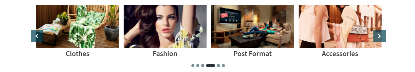
SWE Post Category Slider is a widget of SW Post Elements plugin – a powerful Elementor addon for blogs, newspapers, magazine websites. It will help to show the post categories as a slider beautifully in different styles.
SWE Post Category Slider Settings
Backend Settings: See screenshot
CONTENT:
Content Settings:
- Layout Style: Choose Default, Image Left or Content Overlay style for the slider.
- Post Format Media: Choose Show or Hide to activate/ deactivate option to use post format media.
- Show Image: Choose Show or Hide to activate/ deactivate option to use image.
- Image Size: Choose and use the image size for the slider.
- Show Post Author: Choose Show or Hide the post author in the slider.
- Show Post Categories: Choose Show or Hide the post category in the slider.
- Show Post Excerpt: Choose Show or Hide to enable/disable the post excerpt in the slider.
- Excerpt Line: Enter the value for the excerpt lines.
- Show Read More: Choose Show or Hide to enable/disable the read more in the slider.
- Read More Text: Enter the read more text of the post to show in the slider.
- Show Info Icon: Choose Show or Hide to enable/disable the info icon of the post in the slider.
Querry:
- Categories: Choose the categories to show post in the slider
- Post Number: Enter the number of the posts to show in the slider.
- Exclude post IDs: Enter the IDs of the posts to exclude from the slider.
- Order By: Set the post filters to order the posts in the slider.
- Order: Choose DESC or ASC to the post as descending or ascending in the slider.
Slider Config:
- Slides To Show: Set the number of columns to show in the slider.
- Slides To Rows: Set the number of rows to show in the slider.
- Slides To Scroll: Set the number of product to scroll in each slide.
- Space Items: Set the space between items in the slider.
- Arrows: Choose Show or Hide the arrow of the slider.
- Dots: Choose Show or Hide the dots of the slider.
- Autoplay: Choose Show or Hide to use or not use the autoplay mode for the slider.
- Autoplay Speed: Choose the speed of autoplay for the slider.
- Loop: Choose Show or Hide to use or not use the loop for the slider.
- Lazy Load: Choose to use the lazy load as Progressive or On Demand for the slider.
STYLE:
- Post Items: Include options for background, padding, border type, boder radius and space.
- Post Image: Include options for fix image, height, border, background, opacity.
- Post Content: Include options for position, typography, color, background, border type, border radius, padding, and margin of the post title, info, description and read more text.
- Arrows & dots: Include options for space, block, size, color, background, border radius.
ADVANCED:
- Advanced: Include options for margin, padding, z-index, CSS ID, CSS classes.
- Motion Effects: Include options for scrolling effects, mouse effects, sticky, entrance animation.
- Background: Include options for background type.
- Border: Include options for border type, border radius and border shadow.
- Mask: Include options for mask.
- Positioning: Include options for width and position.
- Responsive: Include options to hide on desktop, table or mobile.
- Attributes: Include options to add custom attributes .
- Custom CSS: Include options to add your own custom CSS.
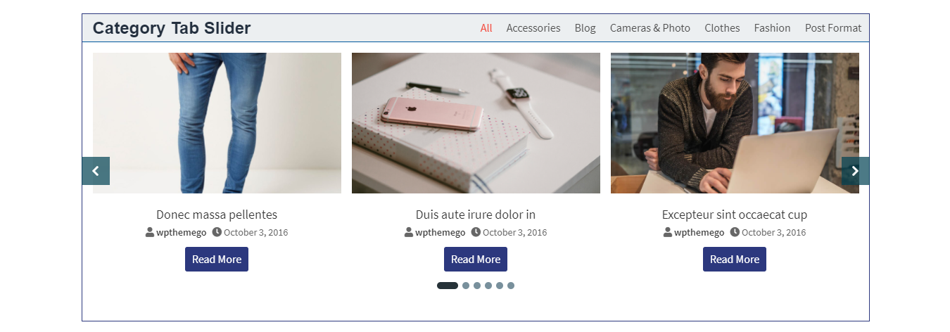
SWE Post Category Tab Slider is a widget of SW Post Elements plugin – a powerful Elementor addon for blogs, newspapers, magazine websites. It will help to show the posts according to the category as a tab in different styles.
SWE Post Category Tab Slider Settings
Backend Settings: See screenshot
CONTENT:
Settings:
- Title: Enter the title for the slider
- Tab Style: Choose style for the tab as Style 1 or Style 2
- Tab Button: Choose style for the tab button as None, Mobile, Tablet or Desktop
Content Post:
- Layout Style: Choose Default, Image Left or Content Overlay style for the slider.
- Show Image: Choose Show or Hide to activate/ deactivate option to use image.
- Image Size: Choose and use the image size for the slider.
- Show Post Author: Choose Show or Hide the post author in the slider.
- Show Post Categories: Choose Show or Hide the post category in the slider.
- Show Post Excerpt: Choose Show or Hide to enable/disable the post excerpt in the slider.
- Excerpt Line: Enter the value for the excerpt lines.
- Show Read More: Choose Show or Hide to enable/disable the read more in the slider.
- Read More Text: Enter the read more text of the post to show in the slider.
- Show Info Icon: Choose Show or Hide to enable/disable the info icon of the post in the slider.
Querry:
- Categories: Choose the product categories to show in the slider.
- Filter: Choose to show products based on a filter as All, Latest, Rating, On Sale, Best Selling or Featured.
- Product Number: Enter the number of products to show .
- Exclude product IDs: Choose product to exclude/ not show in the slider.
- Order By: Choose the order to show the products based on None, ID, Author, Title, Date, Menu Order, Random, Modified, Comment Count or Parent.
- Order: Choose DESC or ASC to show the products descending or ascending.
Slider Config:
- Slides To Show: Set the number of columns to show in the slider.
- Slides To Rows: Set the number of rows to show in the slider.
- Slides To Scroll: Set the number of product to scroll in each slide.
- Space Items: Set the space between items in the slider.
- Arrows: Choose Show or Hide the arrow of the slider.
- Dots: Choose Show or Hide the dots of the slider.
- Autoplay: Choose Show or Hide to use or not use the autoplay mode for the slider.
- Autoplay Speed: Choose the speed of autoplay for the slider.
- Loop: Choose Show or Hide to use or not use the loop for the slider.
- Lazy Load: Choose to use the lazy load as Progressive or On Demand for the slider.
STYLE:
- Head: Include options for background, padding, border type, boder radius and space.
- Title Head: Include options for position, typography, color, background, border type, border radius, padding, and margin.
- Tab Items: Include options for position, typography, color, background, border type, border radius, padding, and margin.
- Tab Content: Include options for border type, border radius, padding, and width.
- Post Items: Include options for background, padding, border type, boder radius and space.
- Post Image: Include options for fix image, height, border, background, opacity.
- Post Content: Include options for position, typography, color, background, border type, border radius, padding, and margin of the post title, info, description and read more text.
- Arrows & dots: Include options for space, block, size, color, background, border radius.
ADVANCED:
- Advanced: Include options for margin, padding, z-index, CSS ID, CSS classes.
- Motion Effects: Include options for scrolling effects, mouse effects, sticky, entrance animation.
- Background: Include options for background type.
- Border: Include options for border type, border radius and border shadow.
- Mask: Include options for mask.
- Positioning: Include options for width and position.
- Responsive: Include options to hide on desktop, table or mobile.
- Attributes: Include options to add custom attributes .
- Custom CSS: Include options to add your own custom CSS.
SWE Post Tabs is a widget of SW Post Elements plugin – a powerful Elementor addon for blogs, newspapers, magazine websites. It will help to show the posts according to the filters as a tab in different styles.
SWE Post Tabs Settings
Backend Settings: See screenshot
CONTENT:
Content Post:
- Layout Style: Choose Default, Image Left or Content Overlay style for the slider.
- Show Image: Choose Show or Hide to activate/ deactivate option to use image.
- Image Size: Choose and use the image size for the slider.
- Show Post Author: Choose Show or Hide the post author in the slider.
- Show Post Categories: Choose Show or Hide the post category in the slider.
- Show Post Excerpt: Choose Show or Hide to enable/disable the post excerpt in the slider.
- Excerpt Line: Enter the value for the excerpt lines.
- Show Read More: Choose Show or Hide to enable/disable the read more in the slider.
- Read More Text: Enter the read more text of the post to show in the slider.
- Show Info Icon: Choose Show or Hide to enable/disable the info icon of the post in the slider.
Querry:
- Categories: Choose the product categories to show in the slider.
- Filter: Choose to show products based on a filter as All, Latest, Rating, On Sale, Best Selling or Featured.
- Product Number: Enter the number of products to show .
- Exclude product IDs: Choose product to exclude/ not show in the slider.
- Order By: Choose the order to show the products based on None, ID, Author, Title, Date, Menu Order, Random, Modified, Comment Count or Parent.
- Order: Choose DESC or ASC to show the products descending or ascending.
STYLE:
- Head: Include options for background, padding, border type, boder radius and space.
- Title Head: Include options for position, typography, color, background, border type, border radius, padding, and margin.
- Tab Items: Include options for position, typography, color, background, border type, border radius, padding, and margin.
- Tab Content: Include options for border type, border radius, padding, and width.
- Post Items: Include options for background, padding, border type, boder radius and space.
- Post Image: Include options for fix image, height, border, background, opacity.
- Post Content: Include options for position, typography, color, background, border type, border radius, padding, and margin of the post title, info, description and read more text.
- Arrows & dots: Include options for space, block, size, color, background, border radius.
ADVANCED:
- Advanced: Include options for margin, padding, z-index, CSS ID, CSS classes.
- Motion Effects: Include options for scrolling effects, mouse effects, sticky, entrance animation.
- Background: Include options for background type.
- Border: Include options for border type, border radius and border shadow.
- Mask: Include options for mask.
- Positioning: Include options for width and position.
- Responsive: Include options to hide on desktop, table or mobile.
- Attributes: Include options to add custom attributes .
- Custom CSS: Include options to add your own custom CSS.
SWE Recently Viewed Posts is a widget of SW Post Elements plugin – a powerful Elementor addon for blogs, newspapers, magazine websites. It will help to show the recently viewed posts on a single post page or other pages.
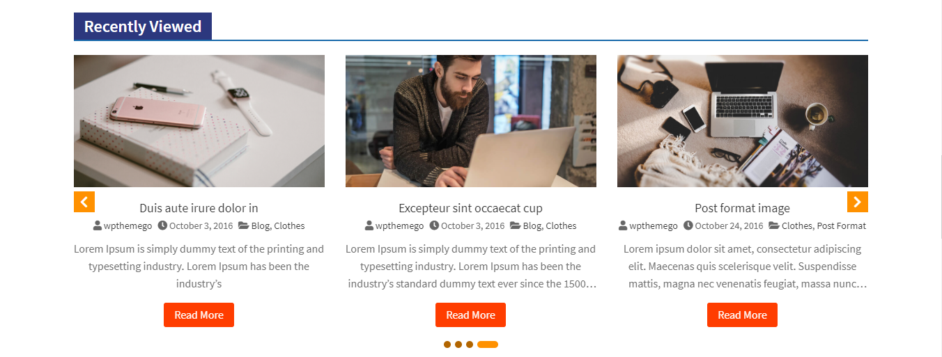
SWE Recently Viewed Posts Settings
Backend Settings: See screenshot
CONTENT:
Content Settings:
- Title: Enter the title for the slider
- Layout Style: Choose Default, Image Left or Content Overlay style for the slider.
- Post Format Media: Choose Show or Hide to activate/ deactivate option to use post format media.
- Show Image: Choose Show or Hide to activate/ deactivate option to use image.
- Image Size: Choose and use the image size for the slider.
- Show Post Author: Choose Show or Hide the post author in the slider.
- Show Post Categories: Choose Show or Hide the post category in the slider.
- Show Post Excerpt: Choose Show or Hide to enable/disable the post excerpt in the slider.
- Excerpt Line: Enter the value for the excerpt lines.
- Show Read More: Choose Show or Hide to enable/disable the read more in the slider.
- Read More Text: Enter the read more text of the post to show in the slider.
- Show Info Icon: Choose Show or Hide to enable/disable the info icon of the post in the slider.
Querry:
- Post Number: Enter the number of the posts to show in the slider.
- Exclude post IDs: Enter the IDs of the posts to exclude from the slider.
- Order: Choose DESC or ASC to the post as descending or ascending in the slider.
Slider Config:
- Slides To Show: Set the number of columns to show in the slider.
- Slides To Rows: Set the number of rows to show in the slider.
- Slides To Scroll: Set the number of product to scroll in each slide.
- Space Items: Set the space between items in the slider.
- Arrows: Choose Show or Hide the arrow of the slider.
- Dots: Choose Show or Hide the dots of the slider.
- Autoplay: Choose Show or Hide to use or not use the autoplay mode for the slider.
- Autoplay Speed: Choose the speed of autoplay for the slider.
- Loop: Choose Show or Hide to use or not use the loop for the slider.
- Lazy Load: Choose to use the lazy load as Progressive or On Demand for the slider.
STYLE:
- Post Items: Include options for background, padding, border type, boder radius and space.
- Post Image: Include options for fix image, height, border, background, opacity.
- Post Content: Include options for position, typography, color, background, border type, border radius, padding, and margin of the post title, info, description and read more text.
- Arrows & dots: Include options for space, block, size, color, background, border radius.
ADVANCED:
- Advanced: Include options for margin, padding, z-index, CSS ID, CSS classes.
- Motion Effects: Include options for scrolling effects, mouse effects, sticky, entrance animation.
- Background: Include options for background type.
- Border: Include options for border type, border radius and border shadow.
- Mask: Include options for mask.
- Positioning: Include options for width and position.
- Responsive: Include options to hide on desktop, table or mobile.
- Attributes: Include options to add custom attributes .
- Custom CSS: Include options to add your own custom CSS.
SWE Related Post Slider is a widget of SW Post Elements plugin – a powerful Elementor addon for blogs, newspapers, magazine websites. It will help to show the related posts as a slider on a single product page.
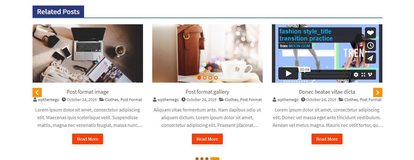
SWE Related Post Slider Settings
Backend Settings: See screenshot
CONTENT:
Content Settings:
- Title: Enter the title for the slider
- Layout Style: Choose Default, Image Left or Content Overlay style for the slider.
- Post Format Media: Choose Show or Hide to activate/ deactivate option to use post format media.
- Show Image: Choose Show or Hide to activate/ deactivate option to use image.
- Image Size: Choose and use the image size for the slider.
- Show Post Author: Choose Show or Hide the post author in the slider.
- Show Post Categories: Choose Show or Hide the post category in the slider.
- Show Post Excerpt: Choose Show or Hide to enable/disable the post excerpt in the slider.
- Excerpt Line: Enter the value for the excerpt lines.
- Show Read More: Choose Show or Hide to enable/disable the read more in the slider.
- Read More Text: Enter the read more text of the post to show in the slider.
- Show Info Icon: Choose Show or Hide to enable/disable the info icon of the post in the slider.
Querry:
- Post Number: Enter the number of the posts to show in the slider.
- Exclude post IDs: Enter the IDs of the posts to exclude from the slider.
- Order: Choose DESC or ASC to the post as descending or ascending in the slider.
Slider Config:
- Slides To Show: Set the number of columns to show in the slider.
- Slides To Rows: Set the number of rows to show in the slider.
- Slides To Scroll: Set the number of product to scroll in each slide.
- Space Items: Set the space between items in the slider.
- Arrows: Choose Show or Hide the arrow of the slider.
- Dots: Choose Show or Hide the dots of the slider.
- Autoplay: Choose Show or Hide to use or not use the autoplay mode for the slider.
- Autoplay Speed: Choose the speed of autoplay for the slider.
- Loop: Choose Show or Hide to use or not use the loop for the slider.
- Lazy Load: Choose to use the lazy load as Progressive or On Demand for the slider.
STYLE:
- Post Items: Include options for background, padding, border type, boder radius and space.
- Post Image: Include options for fix image, height, border, background, opacity.
- Post Content: Include options for position, typography, color, background, border type, border radius, padding, and margin of the post title, info, description and read more text.
- Arrows & dots: Include options for space, block, size, color, background, border radius.
ADVANCED:
- Advanced: Include options for margin, padding, z-index, CSS ID, CSS classes.
- Motion Effects: Include options for scrolling effects, mouse effects, sticky, entrance animation.
- Background: Include options for background type.
- Border: Include options for border type, border radius and border shadow.
- Mask: Include options for mask.
- Positioning: Include options for width and position.
- Responsive: Include options to hide on desktop, table or mobile.
- Attributes: Include options to add custom attributes .
- Custom CSS: Include options to add your own custom CSS.
TRANSLATION
Yes. SW Post Elements plugin supports multilanguage. We recommend you to use WPML plugins following the WPML Documentation in the plugin.
To use Loco in SW Post Elements plugin, you can install Loco Translate first. After that, you can use Loco to translate SW Post Elements plugin.
You can follow Beginner’s guide for Loco Translate in SW Post Elements Plugin
SUPPORT FOR SW POST ELEMENTS PLUGIN
To help speed along your request, we require that you follow the steps below before submitting a new support ticket. This is for the benefit of everyone and will help make the entire process more efficient. It’s very important and we ask that everyone who posts follow these steps.
Read the item documentation first:
Many support queries and technical questions will already be answered in supporting documentation such as FAQ’s and comments from previous buyers. You can find more tutorials via the Frequently Asked Questions, WPThemeGo Forum and WPThemeGo Youtube Channel
We support SW Post Elements following Envato Support Policy:
We will check and reply the ticket in 01 business day (except for weekends and holiday). Please check the Support Policy to see what’s included and what’s not included in item support.
Please note that for each item purchase code, only 01 website should be supported. If your support license expired, please renew it to get technical support.
Important things for your website:
- Runs the latest version of SW Post Elements and meets all Theme Requirements.
- Disable any additional 3rd party plugins you may be using to see if it fixes the issue.
- Clear and disable all caches including browser cache, plugin cache and server cache.
To create a support ticket for SW Post Elements, please choose the Department as Themeforest then enter the theme purchase code to submit the ticket. Please note that your site’s information and some screenshots for the issue will be easier for us to get the question and help you faster.


Important!
- Do NOT reply the ticket via notification email. Any reply via this no-reply-email may be missed because our support team could not read it.
- If you get trouble with the ticket system, please contact us via email contact@wpthemego.com to get help. However, the first one is more convenience and easier for both of us to follow the issue.