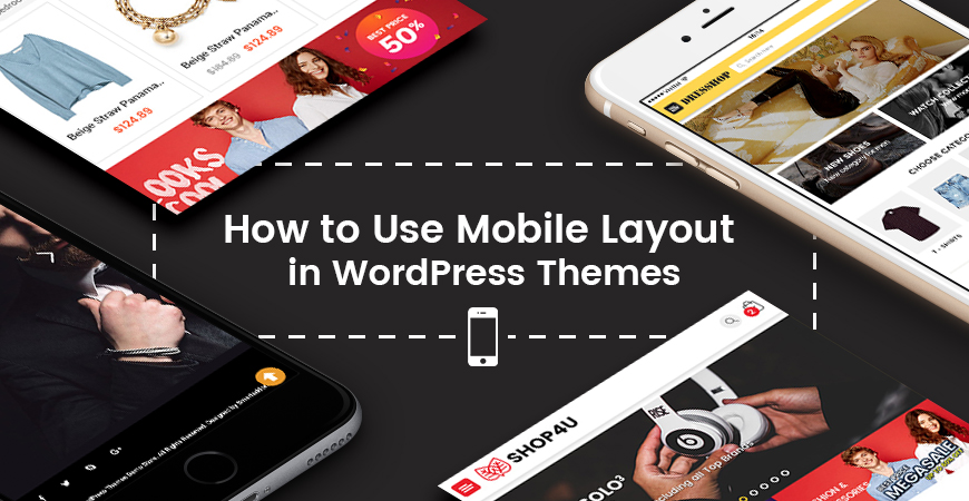
Up to 90% of us go shopping on bed with our mobile today, that’s why building a website responsive is essential point. However, we can do more than that! Mobile Layout has been developed and your website now works like an app on mobile now.
Mobile Layout is a new and unique design by our team for our WordPress themes in 2017. With this new development, it can help your website to be more convenience for customers and convert more sale every day.
Today, we will share you some tips on how to use mobile layout in your website.

What is Mobile Layout?
Do you want to have a professional online store on mobile devices?
Unlike other themes which support responsive layouts only, our theme is built with both responsive layouts and mobile-specific web designs with full of shop features, specifically designed and developed for mobile devices. This is the trend of online store 2018 – when using and shopping via smartphones is increasing rapidly!
By using mobile layouts, you can build a mobile-friendly website and bring your customers a great mobile shopping experience. You’re able to enable these layouts in theme option based on your market strategies.
If you don’t want the mobile layout, you can disable it and the responsive layout will be applied automatically.

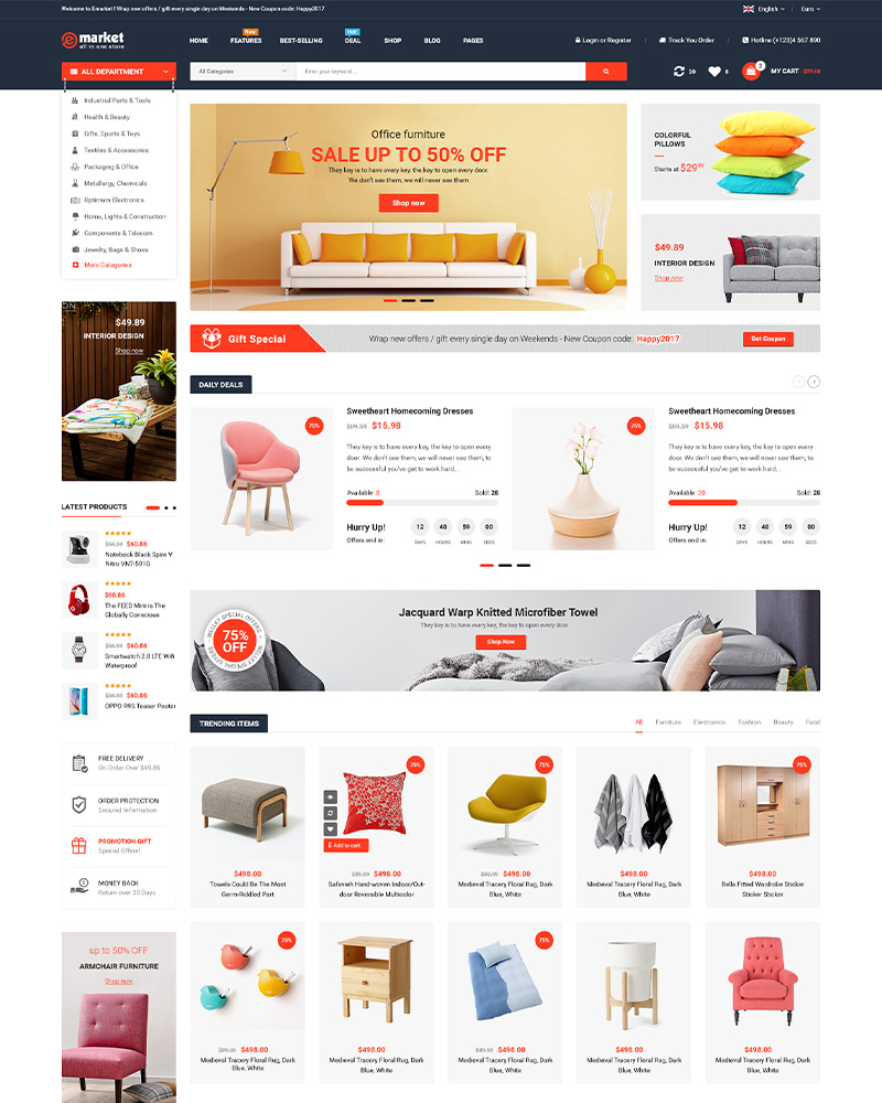
Mobile Layout of BosMarket – Trending Flexible Multivendor WooCommerce Theme
Home Mobile
When entering into a website, this will be the one that can attract your customers’ love at the first sight. Using mobile layout, you can configure your home page on mobile to be much more user-friendly and high user experience with slider, images, products, countdown deals and other information.
Mobile Menu
Mobile layout provide you with vertical menu at the header and other menu at the mobile footer.
Mobile Header
Mobile header contains logo, vertical menu, cart, search box and other elements. You can configure mobile header style easily in the Theme Options.
Mobile Footer
Mobile Footer is fixed at the end of page with Home, Search, Cart, My Account and More button for more items of the page.
Mobile Logo
If you want to have your logo look more beautifully on mobile, you can use different mobile logo by uploading it in the Theme Options easily.
Beside, there are much more elements those are designed only for mobile layout. You can try it with mobile demo for eMarket – Best-selling eCommerce & MarketPlace WordPress Theme as an example.

How to Use Mobile Layout in WordPress Website?
After installing WordPress themes with mobile layout ready, you can easily enable and use mobile layout for your website. Below are some steps for you to follow.
1. Configure Mobile Menu
To have menu on mobile, we need to create menus for mobile in both header and footer. Usually, we need 02 menus. They are Vertical Menu (or Mobile Menu 1 in some case) and Mobile Menu (or Mobile Menu 2 in some case).
To have Mobile Menu, please go to Appearance > Menus and create Mobile Menus assigned to Mobile Menu Display Location Vertical Menu (or Mobile Menu 1 in some case) and Mobile Menu (or Mobile Menu 2 in some case).

2. Configure Home Mobile
Now, you need to go to Pages > All Pages and choose your page Home Mobile to configure your site’s data. This will be your home page on mobile layout.
This mobile page is available when you install and import our themes with mobile layout ready. Also, you can easily edit the page elements with Visual Composer.

Also, in some theme, we provide you with page on mobile layout like Contact Us, About Us. You can also configure it with page builder normally like Home mobile.
3. Set Mobile Layout Options in Theme Options
Firstly, to have Mobile Layout for your website, you need to activate it by going to Appearance > Theme Options > Mobile Layout and check option Enable Mobile Layout. If this option is not enable, the responsive mode will be automatically applied.
Moreover, in this tab, you can also upload the mobile logo image, active sticky mobile for header, choose mobile layout content for home page, and choose header and footer stye for mobile layout as you want.

4. Configure Mobile Filter
Mobile Filter is the one you see in Product Listing page. You can add it by going to Appearance > Widget and add filter widget for WooCommerce products into the Filter Mobile section.

In the end, you can use mobile to check and see the mobile layout of your website now.
See Our Best-selling WordPress Themes 2020:
See our theme collections:
-
- See Best-selling WordPress themes on Themeforest 2020
- See Best free and premium WordPress themes 2020
- See Best multi-vendor marketplace WordPress themes 2020
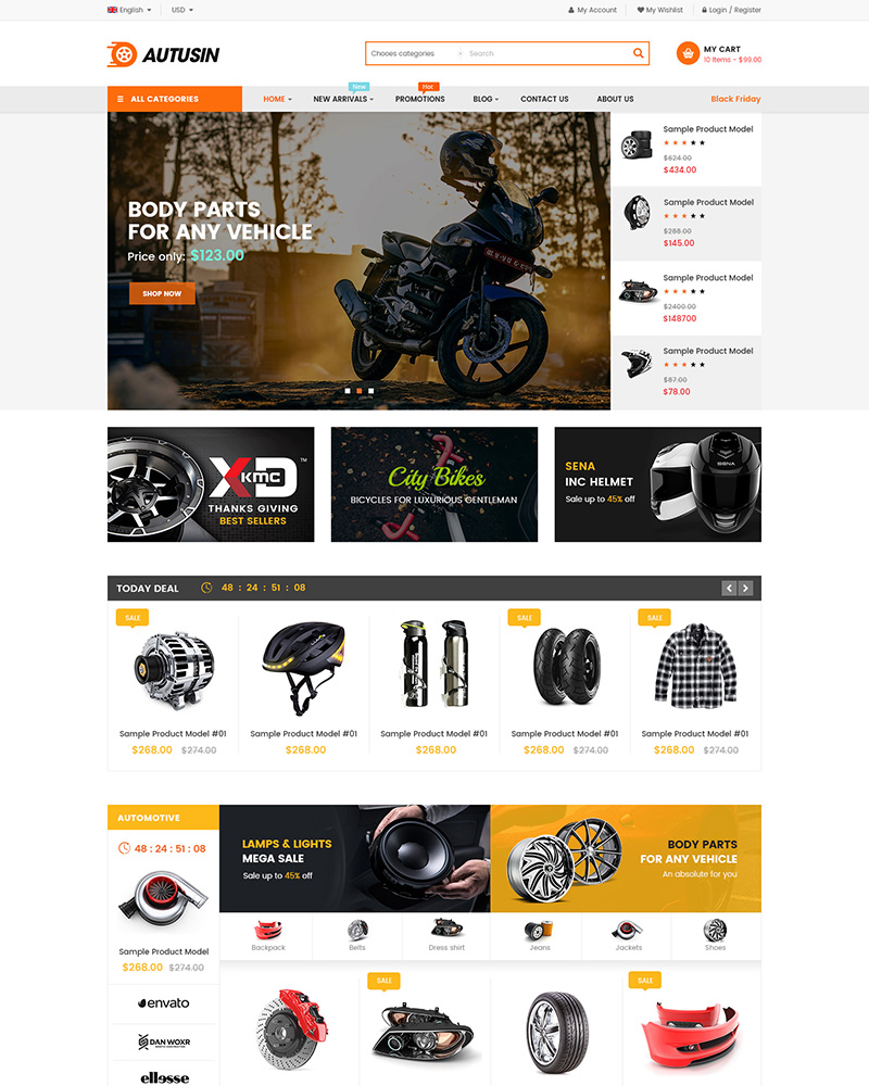
- See 12+ Best Auto Parts Shop WordPress Themes 2020
- See 15+ Best Clothing & Fashion Shop WordPress Themes 2020
- See 20+ Best Electronics Store WooCommerce Themes 2020
- See 15+ Best Selling Furniture Store WordPress Themes 2020
Our Support Help Desks:
Documentation: Find documentation for themes and frequently asked question on our Documentation channel wpthemego.com/document
Forum Support: Join our public WPThemeGo Community at forum.wpthemego.com to find the frequently asked questions, post your problem and get support to solve it.
Ticket System: Submit a ticket about your problem on WPThemeGo Support at support.wpthemego.com to get help from the support team. All your information will be kept confidential.
Email Support: Contact us via email for presale questions about our themes and other questions via contact@wpthemego.com.